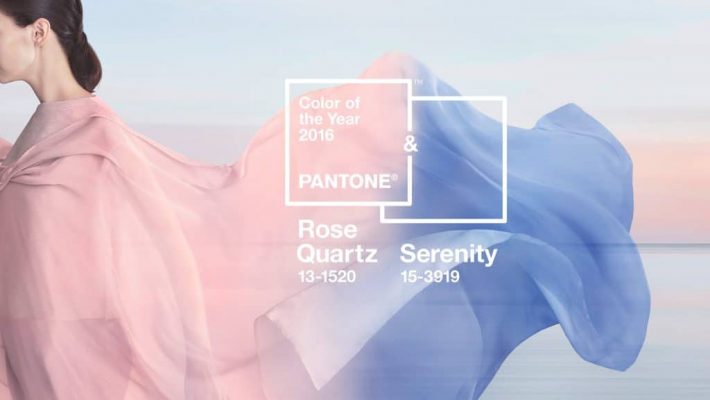
Still going strong in 2016 are Rose Quartz and Serenity.
Trend forecasters at the Pantone Color Institute have broken with tradition this year by announcing not one but TWO different shades for their “Colour of the Year” selection:
- ROSE QUARTZ (PANTONE 13-1520) and
- SERENITY (PANTONE 15-3919)
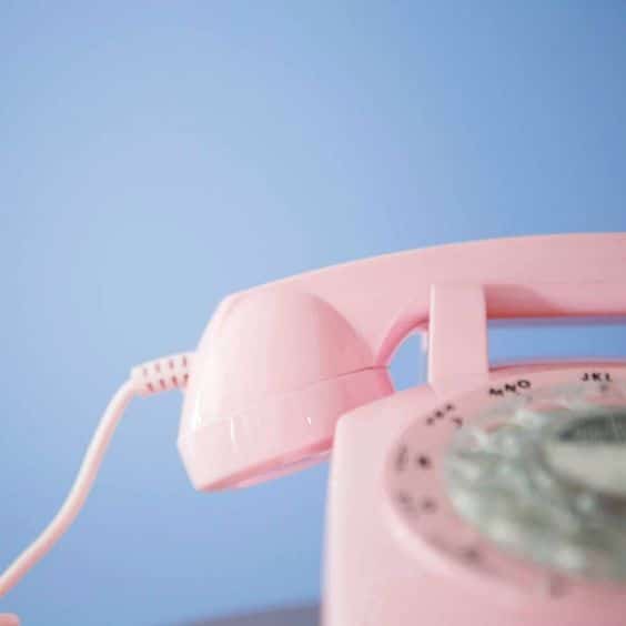
The two colours are a dusky pink and a soothing, tranquil blue.
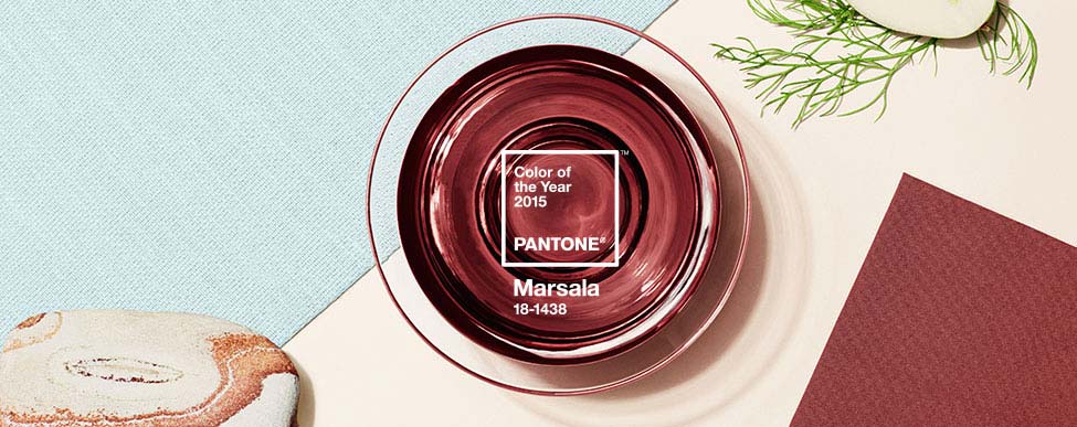
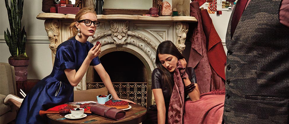
Pantone, who are the world’s leading authority on colour, have only ever chosen one shade in previous years. Last year’s prediction went to “Marsala”, a naturally robust and earthy wine red. Sure enough, this colour was found up and down the high-street come autumn.
The blue and pink shades selected for 2016 are a stark contrast to last year’s selection, Marsla. The two hues are what Pantone call a “softer take on colour” for the year ahead.
About Rose Quartz and Serenity:
According to the company, the chosen colours are a “harmonious pairing of inviting shades that embody a mindset of tranquility and inner peace”.
Here’s how Pantone describe both colours:
“Rose Quartz is a persuasive yet gentle tone that conveys compassion and a sense of composure.”
“Serenity is weightless and airy, like the expanse of the blue sky above us, bringing feelings of respite and relaxation even in turbulent times.”
So, how were these two shades selected?
Pantone’s colour experts spend time researching new influences, scouring the earth for anything that may impact colour trends in the year ahead. They attend fashion shows, look to the art and design world, visit top travel destinations, understand how peoples’ lifestyles are changing across the globe and explore new materials and technologies.
Here’s a look at two of the biggest influences on this year’s colour selection:
1) Gender:
This year, Pantone have used the two shades symbolically, to represent a current snapshot of our culture. Specifically, they wanted to represent the parts of the world that are increasingly moving towards gender equality and fluidity – a topic that made headlines on multiple occasions throughout 2015 and will continue to do so into the future.
 2) Mindfulness:
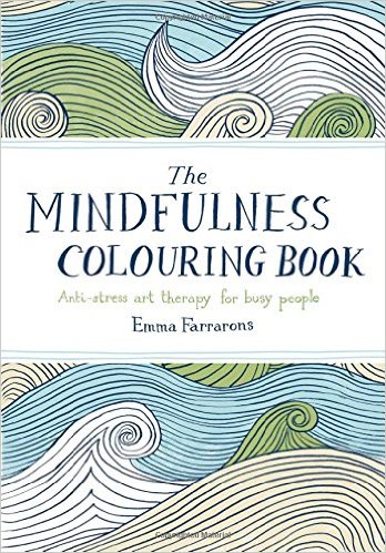
In addition, Pantone chose the two colours to add a little calm in a world where consumers actively “seek out antidotes to the stresses of our modern day lives”. And they have a valid point – we do! You only have to walk into your local bookshop to see shelving full of adult colouring books, which have seen a huge surge of popularity in recent months, while self help and personal development tools like mindfulness and meditation all increase in popularity on a daily basis.
Knowing this, Pantone have selected the two hues that emit air of tranquility and a sense of peace when used together. Perfect for adding a little calmness to our ever increasing busy lives.
Using these two shades in your interiors:
Invite a sense of calm and relaxation into your home by using the two colours in your next interior design project. The two shades work together to provide a harmonious atmosphere, ideal if you’d like to create a peaceful bedroom, relaxing bathroom or tranquil living room.
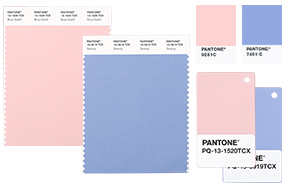 Pantone recommend using the colours in your home accessories, such as candles, vases, florals and tableware. The key is to look for translucent, glazed or matte finishes on products.
Combine Rose Quartz and Serenity coloured furnishings, such as curtains, rugs and linens. Layer plain and pattered fabrics to incorporate the theme into your room with ease.
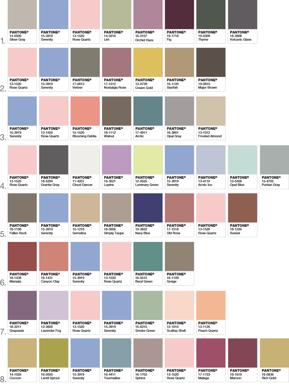
Need a little inspiration? Here are a few colour schemes Pantone suggest you use for your home –
Related reading from Interior Desire: Key Trends for 2016
Main Image Source
