Interior Design; we all harbour a little penchant for it!
Our home is our castle and we all want to make sure it is a reflection of our personalities and our intentions; do we want to feel relaxed, inspired, bask in our memories, motivated.
A home shouldn’t be bland, but sometimes we become so overwhelmed with the idea of having the ‘perfect’ home means that all creativity is lost! If this sounds like something that you are experiencing, read on to discover 3 of 2016s biggest trends.
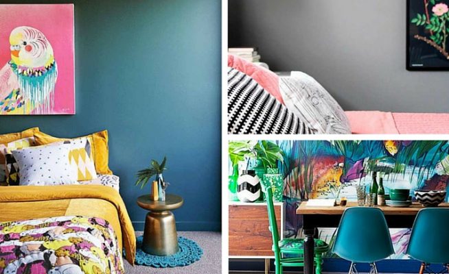
Tropical
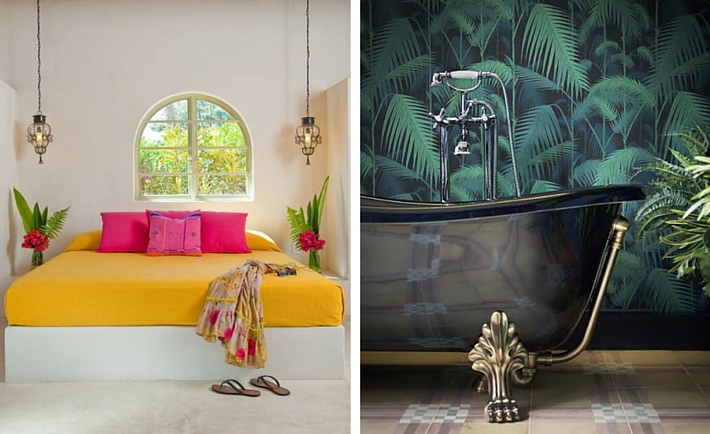
Summer brings out the fun and frivolous side in all of us, so why not reflect this in the home too? Giving your home a tropical twist is topical through spring and summer, but the colour used will also serve to boost our mood when the cold winter months roll around too.
So what is on the colour palette? Bold and vibrant shades of hot pink, bright greens and sunshine yellows with metallic hints of gold. If you are feeling brave then there are some amazing wallpapers to choose from with botanical or jungle prints – go hard or go home. Take the theme even further with your furniture and go for 70’s retro bamboo or rattan – this is a trend that you need to be 100& committed to and is not for the faint hearted.
You want clashing colours and patterns and you aren’t going to apologise for it. For flooring, a quality hardwood floor in any shade will work well, it ultimately depends on your furniture, but be sure to include a statement rug that suits the theme in a zesty colour.
Be sure to include plants and foliage in your tropical theme; not only do they always manage to breathe life into our homes, they are proven to reduce stress and increase our sense of wellbeing. Hardy plants with big leave and bright flowers would suit, again – remember that you want to make a statement.
Sonia Mundley from Yellow Book Interiors explains, “If this theme seems familiar, well that is no surprise as this is the year of collaboration between the worlds of fashion and interiors. Ideas from the catwalk have been translated into collections with which to dress your home.”
Pantone
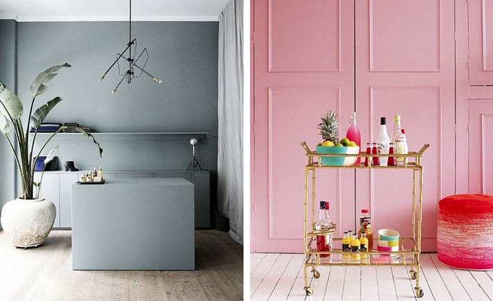
In contrast to the unapologetic Tropical theme, Pantone have given us their 2016 colour palette and they are feminine, soft shades that ooze romance. The colours of the year from the Pantone palette are Rose Quartz and Serenity; a blush pink and soft lavender tinged blue.
It’s a trend that even furniture and fixture manufacturers are picking up on; Superior Surfaces commented, “We’ve noticed that there are couple of colour trends at the moment which have proven to be popular. One is for very plain, light colours like pale greys, or even shades similar to the Pantone colour of the year. The other is for colours which have lots of veins running throughout in marble effect.”
Light grey is often the perfect companion to soft pinks such as Rose Quartz, and makes a room feel cool and calming and enhances the light, giving it a feeling of space. When using these colours, think about how you would describe them and use these adjectives to guide you in your choice of accessories. Plush crushed velvet for cushions throws, and carpets with a luxurious deep pile suit the trend.
Soft mood lighting is required with lots of candles, a sprinkling of fairy lights and table lamps to set the scene. Again, if you are opting for some indoor foliage, pretty plants like orchids and peace lilies in statement pots would provide the perfect accent.
Native
Hazy, lazy sandy days in the desert -this is bohemian without the whimsical edge. Look to natural elements to make statements; wood and stone for flooring, walls and furniture make a good base. The key to the native trend is to opt for raw and rustic styles, everything is undone and mismatching.
When it comes to colour, warm and natural tones provide a good base while pops of colour and pattern should be provided by ethnically printed cushions, throws and large rugs in geometric Native American patterns, however you could also look to Moroccan inspired interiors to suit here too. If you wish to tone down the colour palette, swapping the bright primary shades out for hints of turquoise and copper provides a more reserved, elegant space; especially when coupled with darker furniture and flooring.
“As a material, copper is beautiful and will always be in style in some way or another,” confirm the team at the Nathan + Jac.
For accessories, it’s all about looking back to Mother Nature; you will find that faux animal prints feature heavily as does greenery. Look to incorporate large, floor standing statement leafy plants along with smaller cacti and succulents.
Lighting, should be soft and well thought out; Using metal or stone bases or even mason jars housing delicate fairy lights. Or for a more masculine edge you could take inspiration from the Industrial Vintage trend and opt for a metal theme on your lighting fixtures.