Is your dining room in dire need of a makeover? If so, you’re probably leafing through interior design magazines and researching colour schemes on Pinterest.
Some would argue that the colour scheme is the most important part of a redesign. We use colour to communicate on our behalves, to invoke a particular mood or create a certain atmosphere, so its crucial to get it just right. However, not all of us are blessed with natural interior design abilities. As such, we’ve put together three different options to help inspire you. Enjoy flicking through the picture galleries and let us know which colour you choose by leaving a comment below!
Au natural:
Pair natural colours with organic textures and themes from nature to create a warm and inviting dining room.


Hero colours: Varying tones of earthy brown, sage green, linen/hessian, natural wood and stone grey.
- What these colours communicate: This is a calming, relaxed atmosphere.
- Pros: Not too modern in style, so ought to have good longevity
- Cons: Can look a little dark if you do not have enough natural light
- Top tip: Create the perfect table centrepiece by using clear vases filled with poppy stems or other wild flowers.
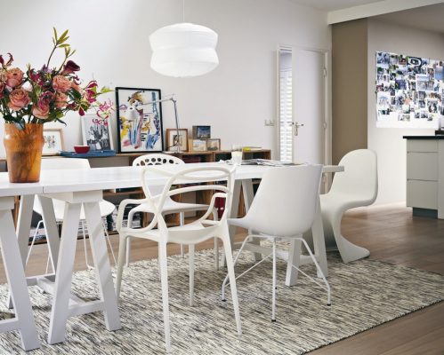
White and bright
Beige might be boring, but white is all right! White-on-white is one of the biggest trends right now. Simply abandon the notion of “an accent colour” by only using shades of white throughout your room. The result is minimalist and fresh.


Hero colours: White obviously! Pay particular attention to undertones – some white shades have a warm pink or cold blue undertone. Check your shades blend together. Very soft “dove grey” colours will add a little depth, while natural oak pieces of furniture will add a warm tone to your room without compromising the theme.
- What this colour communicates: An airy, light and spacious room.
- Pros: Very trendy.
- Cons: Hard to get right for novice interior decorators; difficult to keep looking pristine and clean (especially with little ones around!)
- Top tip: A chandelier-style light fitting above your table will bring a little sparkle to your next dinner party. Arrange bunches of white flowers in vases to accentuate the theme.
Splash of colour
Take the colour du jour and splash it all over your walls for a bold, bright and joyful room.


Hero colours: go as loud and as proud as you please: electric blue, bright teal, sunshine yellows, vivid pink, etc.
- What these colours communicate: We’re bright, bold and quirky. Not scared to attempt the latest colour trend!
- Pros: Offer the chance to be unique and stand out amongst friends’ and family’s homes.
- Cons: Trends change, colours go out of fashion and you may fancy something a little more shy and retiring down the road.
- Top tips: Not brave enough to paint all four of your walls in the same bold shade, or contrasting colours? Why not opt for keeping three of the walls plain and creating a feature wall on the forth?
Featured image source: kelaty.com